Wednesday, March 30, 2016

How to check Before and After in Lightroom

I find it really handy (and kinda cool) to see the before and after image after I'm done with my post processing in Lightroom. Besides it being a cool feature, it also helps me to determine whether the editing was effective or maybe a tad over the top. 


Let me start with this picture:
This is actually the original RAW image without any editing

I open the picture do my editing. During the editing I get to see the before and after by clicking on this icon. When it's up, it's the before situation. When it's down, it's the after situation.
 

With all my editing done, I hit the backslash key (\) to see the before and after image. Click it once and you see the before situation. Hit it twice and you get to see the after situation. For Mac users it's Shift + Alt + 7. 

Mind you: you can also see the before and after by clicking on the icon underneath your image: 

The fastest way to compare the before and after is actually pressing the 'Y' on your keyboard. Click it twice to see just the after.

Don't forget to follow us on Facebook or 500px.

And have you already discovered our Facebook page Humans of the Nordic Region?


Sunday, March 27, 2016

How to create a Contact sheet in Lightroom

Creating a contact sheet in Lightroom is very easy and helpfull to present your pictures for a client.

But what exactly is a contact sheet? It is an arrangement of multiple, small, same size images on a single page. You might also give some information about the images such as the image filename placed under the image. The purpose is to provide reference to a larger number of images. You may print them to keep or give to a client as a catalog of the images from a shoot, for example. 

Here's how to make such a contact sheet in Lightroom:

Go to Print Module in Lightroom. You can find the contact sheets in the Lightroom templates


You can choose which pictures you want to have on your contact sheet.

If you choose Selected Photos, don't forget that you must actually select the images in your filmstrip.

You can easily change your  page setup.

Now that have selected the images for your contact sheet, you can modify the layout. 

On the right panel you'll find a lot of different options:

1. Image settings
All settings speaks for themselves. Just try things out to see what works best for your contact sheet.

2. Layout
Here you can choose how many pictures you'd like to have contact sheet (rows and columns) and how much space you want between them. This is also where you choose the margins of your page.

3. Guides
Guides help you to design your contact sheet but will not be printed.

4. Pages
And there's some extra options: 
a. Background
You can change your background colour, but I have found that white works best most of the times. 

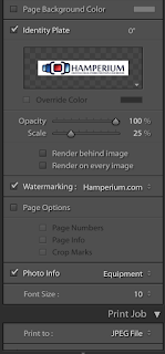
b. Identity plate  
This can be used to add your identity. I choose to use our logo.

c. Watermark
If you want to, you can add a watermark on all pictures in the contact sheet

d. Page options
Here you can put some extra information on your contact sheet, like for example page number.


e. Photo info 
This is where you can add information (photo caption) to all the pictures in your contact sheet, like File name etc. 

5. Print Job
This is where you can change your print settings.

Once you have selected the images and the layout, you can click on the print button and Lightroom will print the Contact Sheet. I love the option to print it as a .pdf file. That way it's really easy to mail it to a client. 

If you want to save all the settings, so that you can use it for another contact sheet, just click on the + in the left panel. Give your template a name and location and save it.

That's all there is to it! Easy right? 

Don't forget to follow us on Facebook or 500px


And have you already discovered our Facebook page Humans of the Nordic Region?


Friday, March 25, 2016

How to use the gradient tool for your layer mask in Photoshop

For some reason, using layers and masks in in Photoshop scares people. I guess I used to be amongst those too, that thought it would be beyond my grasp to use this feature in Photoshop. But let me tell you: using layers makes life easy. And masks are just an easy and powerful tool to increase your creativity.

In a previous post I already touched upon the subject of masks

Do you remember? White revealsblack conceals

Most of the times I add a layer mask and use the brush (B) to paint the mask. But I can also use the Gradient tool (G) to paint the mask.

The gradient tool is real easy to understand. Hit G to activate the Gradient tool: 
First thing to do is to choose a gradient 

These are the basic gradients. If you still want more, click on the small wheel for more options

If you're using a gradient for a mask, you can use the black-to-white gradient.

Next thing you see is the type of gradient:

Lineair gradient:

Radial gradient:

Angle gradient:

Reflected gradient:

Diamond gradient:

To add a gradient again, is very easy. Choose the gradient you want to use and draw a line on your image where you want to apply the gradient. To draw straight lines use the Shift key.

That's the basics covered, but how can one use this for masking you might wonder. Let me give you an example. 

I'll work with this image where I want the background to fade away into another image (with a smooth transition). 

Before I add the gradient, I have to add a layer mask (white) to the top layer. Now I'll use the black-to-white lineair gradient and draw a line from left to ride on the layer mask.

Now you'll see that - depending on the mask - the underlaying layer is more or less visible. On the mask you can see where it's white and black.

You can also play around with the other gradient for example the Radial gradient. 

So don't forget White revealsblack conceals and alway paint on the mask.

Don't forget to follow us on Facebook or 500px


And have you already discovered our Facebook page Humans of the Nordic Region?

Tuesday, March 22, 2016

How to add Metadata in Photoshop

Nine times out of 10, my workflow starts with importing my images into Lightroom and assign metadata. I know, you're wondering about that one other time. That's when I start in Photoshop. Still, when beginning the processing in Photoshop, I still want to assign metadata to my images. Here's how to do it. 

To add metadata to an image in Photoshop go to File > File info


It's pretty straight forward. Fill out the fields and hit Ok.

One thing to remember is to fill out the Copyright information in the description field. Why you might wonder? This really is important because websites like Facebook use the Document title and Description as their photo caption.

You can save the File information as a template and use it for other pictures. Click on the template button at the bottom of the window and then choose export. Don't forget to name your template and save it. 

Open a new picture and have a look at the file info.
 

As you can see, the file information is empty. Instead of filling out all the fields I can just use the saved template to fill it. Click on the Template button at the bottom of the screen and choose Import. Browse to the saved metadata template and  choose Open. 

Now this screen appears. 

Hit Ok and your metadata is now in the file

You can make some changes, like for example the title for this specific picture, and hit Ok to save the metadata to your image.

Shortcut for the File Info = Shift + CMD + OPT + i (Shift + Ctrl+ Alt+ i on windows).

Don't forget to follow us on Facebook or 500px

And have you already discovered our Facebook page Humans of the Nordic Region?

Sunday, March 20, 2016

Photoshop quicktip, how to stretch a background

Sometimes you have a picture but you just want to have a bit more background. In Photoshop it's really easy to arrange this. 

Let's start with this picture.

Next step is working on the extension of the background. Click on C for the crop tool. Enlarge the background and make sure the 'Delete cropped pixels' is off.

Next step is selecting the transparent part of the image and filling it, using the content aware fill. To select use the Magic want tool (W). To fill it go to Edit > fill and choose Content aware

So there you have it: more background and the image went from portrait to landscape. I guess overall it's sort of OK, but there's still some work to be done at the bottom of the image.

You can work with the Patch tool to erase the unwanted (J). Or you can use another technique to fill the transparent part of the image: the Rectangular Marquee tool (M) to make a rectangle of part of the background

Next is expanding the rectangle using Cmd T and dragging the right slider to the right.

Voila, this looks much better right? 

To even it out, the image now needs a bit more space on the left side too, but I guess you know how to do that now. 

To give you even more info: here's a short Youtube video on the subject: 

Don't forget to follow us on Facebook or 500px


And have you already discovered our Facebook page Humans of the Nordic Region?


picture from pixabay.com