Thursday, April 28, 2016

How to work with Long Exposure in cycling images

So I'm really happy in our new home country Sweden. The only thing (besides moorkoppen en kroketten) I miss are the Amsterdam city scenes. So when we had the chance to visit Holland just a couple of weeks ago, I was excited to have the opportunity to shoot some city images again, especially some bike shots. 

As a sports photographer it's pretty easy to make a panning shot of a bike and have everything pinsharp. Just use a very fast shutterspeed  (in this case 1/2500) at something like F4.  

But this time I wanted something different. I wanted to see the movement of the biker in the city environment. So I needed a slower shutterspeed. I tried shutterspeeds of around 1/30. And because I used lower shutterspeeds I went with a diafragma of F10 or smaller (F22).


I tried it on several locations in the city and I have to say I'm pretty happy with the results

In Lightroom I did some post processing. It's important that the face is sharp. Adding a vignette and removing strong colours in the background can be a great help to get (more) focus on the biker.

Don't forget to follow us on Facebook or 500px.

And have you already discovered our Facebook page Humans of the Nordic Region?


Wednesday, April 27, 2016

How to create a watermark in Photoshop

Every now and then it can be useful to add a watermark to your images. Let me tell you it's real easy to make a watermark in Photoshop. 

Start with making a new document with a transparent background. I went with 500 by 500 pixels.

Create your design. I just quickly made one for this tutorial. Took me less than 30 seconds. 

Next is to make the letters white and crop the watermark. Then save it as a .Png file

Voila! Now your newly created watermark is ready to be used! 

Open the picture you want to use. Move the watermark with the move tool (V) to the new image (hit the white when you move it).

You can now find your watermark in the picture. You can move it around and make it bigger or smaller using the Free Transform tool (T)

When you'd like the watermark to be more visible, you can for example give it a black background by making a new empty layer and moving it under the watermark layer. Then make a selection around the watermark with the Rectangular Marquee Tool (M) and fill it with black (or any color you like). Easy right? 

Don't forget to follow us on Facebook or 500px


And have you already discovered our Facebook page Humans of the Nordic Region?


Sunday, April 24, 2016

How to compare pictures in Lightroom

In Lightroom you can compare two images. This can be very helpful for example if you want to pick a similar image but want to know which picture has a better composition or is sharper. So how does this work? 
Start the library module, select an image and then press C on your keyboard.
Lightroom then shows the selected image (Select) and the right image next to it in the filmstrip (Candidate). With your arrow keys you can 'browse' through your filmstrip to select another picture.

You can change the selected image by clicking on another picture in the filmstrip

Instead of using the arrow keys of your keyboard you can use the arrows direct under the candidate to select another candidate.  

With the zoom option you can zoom in on both pictures. This can be very helpful to see if one picture is for example sharper then the other picture.

Under the Candidate are 2 more buttons, one to swap the Selected and the Candidate and one to make the Candidate the Select.

The compare view in combination with rating can be very useful to select the image you want to develop. To quit the Compare View just click on C of your keyboard.

I always use this when doing my post processing, it's part of the workflow. 

Don't forget to follow us on Facebook or 500px

And have you already discovered our Facebook page Humans of the Nordic Region?


Thursday, April 21, 2016

How to create a vintage look in Photoshop

How to give your image the look and feel of an old picture? 

In this post we create a vintage look in just a few easy steps.

So what do you need to create a vintage look? 
  1. Image of a person with an equal background
  2. Image of a old paper. There are lots of them on the net (look for 'old paper texure')
Open your image

Open the image of the texture:

Move (V) the texture with the move tool to the image of the person. Most of the times the texture is smaller then the image. So make it bigger using the Transform tool (Cmd/ Ctrl T)

If you want to use a bigger texture you can make it yourself by shooting pictures of old paper, paint or other textures around you.

Now your texture has the same size as your image. Next is to change the blending mode to Multiply or Linear Burn.

You can reduce the Opacity of the layer or/and mask part of the picture out where you don't want the effect.

You can do the same proces when your subject is against a black background. Move your texture and make it fit. Then invert it using Cmd/ Ctrl T.  Then set the blending mode to something like screen.

A completely new look and feel for your images in just a few easy steps. I hope you have fun with trying this out!

Don't forget to follow us on Facebook or 500px


And have you already discovered our Facebook page Humans of the Nordic Region?


By the way, I work on a Mac so where I say Cmd it's Ctrl on a Windows machine and the pictures I used in this post are from pixabay.com


Wednesday, April 20, 2016

How to put your subject in another background in Photoshop

In this post we're moving our subject and placing it against another background.

I start with 2 pictures:


The goal is to move the girl to the other background (image 1) and make it look realistic. First of all, I've got to cut out the girl from her original background. To do this, I open the picture and use the quick selection tool (W).

I used refine edges to improve the selection and went with output as Selection. I right clicked on the selection and chose 'Layer via cut'. Don't forget to make the background layer inactive here.  

Open the picture of the background. Select the girl and move her to the new background using the Move tool (V). I used the free transform tool (Cmd T) to scale it.

Next I created a shadow around the girl to make it more realistic. Double click on the girl in the layer panel. I chose Drop shadow. 

These are the values I used for the drop shadow. 

Last thing to do is to blur the edges of the selection of the girl with the blur tool. Merge the layers  (Cmd E) down and add some blur around the girl.

This are the basic steps to add a subject to another background. Go on, give it a go!  

Don't forget to follow us on Facebook or 500px


And have you already discovered our Facebook page Humans of the Nordic Region?

By the way, the picture I used comes from pixabay.com

Sunday, April 17, 2016

The rule of what? The Rule of Odds

Today a quicky, a very short post about the Rule of odds

The "rule of odds" suggests that an odd number of subjects in an image is more interesting than an even number. Thus if you have more than 1 subject in your picture, the suggestion is to choose an arrangement with at least three subjects.

So instead of an even number.

Its better to have an odd number of subject in your image.


Just a quick reminder to you all that besides the rule of thirds, it's also good to keep this rule in mind when you're out there shooting. Just see what you can come up with, how you can incorporate this in your images and find what works best for your style.  

Don't forget to follow us on Facebook or 500px

And have you already discovered our Facebook page Humans of the Nordic Region?
By the way, the picture I used comes from pixabay

Thursday, April 14, 2016

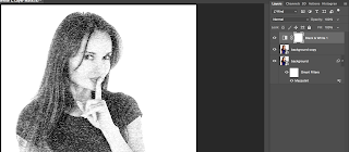
How to transform photos into portraits of inked strokes

Kind of a nifty feature if you ask me: creating a portrait with inked strokes. Let me show you how to do it. 


Open a picture and change it to a smart object: 


Make a copy of the layer (Cmd J) and change its blend mode to lighten


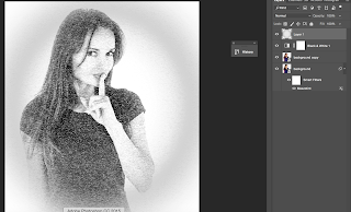
Make the background layer active. Go to Filter > Pixelate > Mezzotint and choose Type = Short lines. Click Ok


Because the layer is a smart object, you can change the type later if you'd like another effect. Make the top layer active and add a black and white adjustment layer

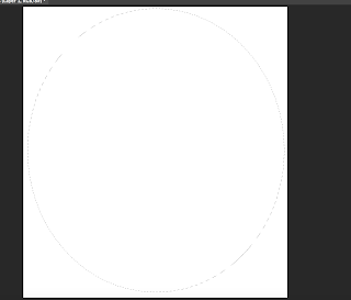
Add a new empty layer and fill it with white

Select the Elliptical Marquee Tool and draw a circle over the whole layer

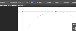
Choose Select > Transform selection. Make the size 90% on the top of your screen

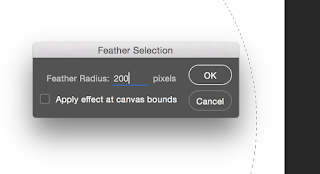
Go to select > Modify > Feather and feather it 200 px and click OK

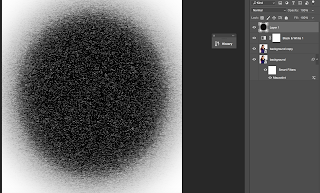
Now we fill the selection with Black and deselect the selection (Cmd D)


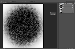
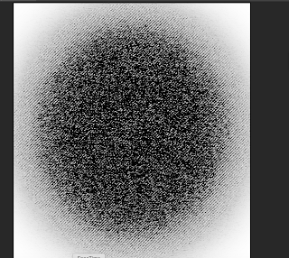
Add the Mezzotint filter to the layer

Go to your channels and click on the Load channel as selection icon at the bottom of the channel

Invert the selection using CMD Shift I

Go back to the layers panel and click Delete and deselect the selection (Cmd D)

To bring some colour back into the image click on the layer mask of the black and white adjustment layer. Choose a brush with 0% hardness and an Opacity round 30%. Make the brush big and paint the face. Make the brush a bit smaller to paint over the mouth and eyes and any other parts where you want to have more colour.
There you have it: the inked strokes portrait! 


By clicking on the filters you can change the effect to for example long lines

Don't forget to follow us on Facebook or 500px

And have you already discovered our Facebook page Humans of the Nordic Region?