Monday, February 29, 2016

Going short in Photoshop

I can't say it often enough: when you work a lot with Photoshop it sure helps to know the keyboard short keys. 

To duplicate a layer: use Cmd J.  This works a heck of a lot faster then going to the layer menu and choosing duplicate layer.

But how do you get to know all the shortcuts? 
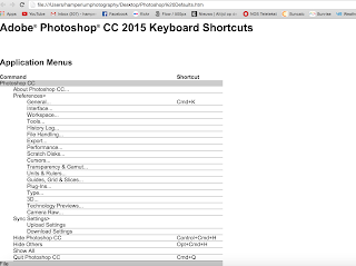
One of the best things to do is to use them. You can easily find your current (default) short cuts in the edit menu:

Click on Summarize to get a list with all your short cuts.

Choose the location and all your short cuts will be saved in a Html document. That way it's easily printable or just for you to read. 

Let me tell you: working with short cuts has sure saved me a lot of time already! 

Don't forget to follow us on Facebook or 500px

And have you already discovered our brand new Facebook page Humans of the Nordic Region?


Note: I work on a Mac so where I say Cmd it's Ctrl on a Windows machine

Friday, February 26, 2016

Useful tips for when exporting photos from Lightroom

When you're done with editing your images, you're ready to share them with the world or send them to your clients. Before either can be done, you have to export your pictures

Here's some useful tips for when exporting your images. 

Select the images you want to export and use Cmd Shift E (Ctrl Shift E in Windows). The export dialogue opens.


There are loads of options you can use. I mostly choose the hard drive to export my images to. 

Export location
This menu gives you the option to choose the location on your (external) hard disk where you want to store your images.

File naming


This is the moment where you name your images. Again, you've got lots of options. A name in combination with a sequence is very helpful when you export more then one image.

File settings
The next step gives you the different options with regards to the format for your images. Most of the times I use JPEG. By increasing the quality you reduce the file size and save some file space.

Color space can best be set on sRGB.

Last option is to limit the file size. It's an option that I actually never use but some say it can be handy.

Image sizing
Here you can resize your image by changing the height and width. You can also choose a resolution for your image: 
  • 72 or 96 for web
  • 300 for print
Output sharpening

This is where you can sharpen the image during export. I don't use it because I always use Lightroom for sharpening my images. 

Metadata
When importing your images into Lightroom, it's really useful to give your images keywords. This greatly facilitates the search in your ever expanding Lightroom image library. When exporting images, again you can choose what data you'd like to export. The more data you use in the export, the better it is for when searching your images. I always choose All metadata.

Watermarking
Here you can add a watermark to your images. You can create your own watermarks. I've written about this in a previous blogpost and we will explore some new ways for watermarking some time soon in a new post. 

Post-processing
Another menu with several options. You can, for example, open a picture in Photoshop after the export. 

A last thing you can do is to save your settings as a preset. So next time you want to export with a specific setting you can use the preset. Just set your setting and click on Add. Give your preset a location and name and you' re done!


Don't forget to follow us on Facebook or 500px.

And have you already discovered our brand new Facebook page Humans of the Nordic Region?

Tuesday, February 23, 2016

Understanding Masks in Photoshop

I still meet lots of people that tell me they think Photoshop is only for professionals and that it's too difficult to work with. I hope to convince you of the contrary with my posts. Sure, it takes a bit of effort and lots of practise, but once you dive into the great world of Photoshop, you'll discover that there are plenty of great and useful things that are easy to understand and to use.

This post is about understanding masks. Now don't zap away, I promise you this really is an easy to understand and useful post!


As always, it starts with a picture:

Now I duplicate the background so that I have 2 layers. Next step is to add a mask by clicking on this icon

Now I have two layers and the top layer has a (white) mask.  

To see the differences between the two layers, I make the background layer black and white by selecting the layer and press Shift Cmd U 

Because the mask is white I can see it. When I make the mask black, it is hidden and you see the underlaying layer (the black and white version of the picture). To invert the mask: select the mask and click on Cmd I.

When you'd like to make part of the coloured layers visible, what you have to do is to paint the mask with the opposite color. In this case I selected a white brush and painted over some parts of the picture.
Don't forget to paint on the mask and not on the layer. On the mask you can now see that some parts are white.

Always remember this rule when you're working with masks:

White revealsblack conceals

If you understand the basics of layers you can also use the adjustment layers. 

I'll start with this picture and I added some adjustment layers

By painting on the mask you decide where in the image the effect will be highlighted

Two key things to remember when working with masks:
  1. White conceals and Black reveals
  2. Paint with the opposite colour on the mask. And when you painted a bit too much by accident, just switch the colour to the opposite color (black or white) to remove the effect.
I hope to have convinced you that working with masks is fun instead of scary. In case you'd like to dive in to this a bit more: there are also loads of clips about this subject on Youtube. 

Don't forget to follow us on Facebook or 500px

And have you already discovered our brand new Facebook page Humans of the Nordic Region?


Sunday, February 21, 2016

Don't like the sky? Here's how to replace a sky in Photoshop

I guess you all know the feeling that you've shot a stunning image, but the one thing that's just not completely right is the sky. Hang tight, that's where the info in this tutorial comes in handy! Here's how to replace a sky using Photoshop. 

This is the picture I start with. 

Step one is duplicating the background layer (Cmd J)


Next is to select the sky. There are many way to do this in Photoshop, but in this case I used the Quick selection tool (W).
 

So the sky is selected:

Then you've got to invert, so that all - except for the sky! - is selected.

And click on Refine Edges


Then choose 'Output to': new layer with layer mask

You'll now see that the sky is transparant.  Also a small part of the plane and the ground are transparant, but that can easily be fixed by painting with white on the mask. Remember: 

WHITE REVEALSBLACK CONCEALS 

Now for the replacing bit: 
Open the sky you'd like to have in your image. 
Then you move your desired sky over the original picture. Drag the layer with the new sky under the layer with the mask.

And then you can use the Brush tool and paint on the mask to correct the part(s) of the plane that is/are covered with the new sky. You can also drag around the sky with the move tool to see what's the best fit for your image. 

Last but certainly not least is to 'warm up the ground' of this picture. The new sky has way more colours in it and that ofcourse should be reflected in the surroundings. 

To do this make a stamp visible layer (Cmd Alt Shift E).

Select the ground with the selection tool you prefer.

To warm it up there are several options. I used the Camera Raw filter and increased the temperature and the Tint. I also decrease the exposure a little.

And voila! Here's my end result

Don't forget to follow us on Facebook or 500px


And have you already discovered our brand new Facebook page Humans of the Nordic Region?

Pictures from pixabay.com

Thursday, February 18, 2016

Cleaning up made fun

A really easy and fast way to clean up a picture is using the patch tool (J). 

When selecting Shift, you can choose another option in the J tool list.

It's practical, easy to use and the results are great. When you know how to use it. Here goes: 
Select the area you want to remove and replace it with another part by moving you mouse or pen to another area. I'm starting  with this picture and want to remove the balloons on the left by using the patch tool. 

Select the patch tool and draw a circle round a balloon and drag the selection to another part of the picture.
  
Do the same with the second balloon. Photoshop replaces both balloons based on the content aware algorithm. Use Cmd D to undo the selections (Ctrl D on Windows). And voila! With these 2 simple actions the balloons are gone

Ofcourse you can also use the Spot healing brush tool or the good old Stamp tool to remove the balloons. But if you ask me, this patch tool is way smoother and easier to work with. Then again, when the area you'd like to clean up is a bit more complicated, you can use a combination of tools.

Another example where I used a combination of tools, but I started with using the patch tool 

I also did some colour corrections with the Camera Raw Filter.

Don't forget to follow us on Facebook or 500px

And have you already discovered our brand new Facebook page Humans of the Nordic Region?

Wednesday, February 17, 2016

Create a sepia look using split toning in Lightroom

Sepia. A much used word in photography and an even more used filter in Instagram I bet. 

What is sepia? 

According to Wikipedia: Sepia is a reddish-brown color, named after the rich brown pimment derived from the ink sac of the common cuttlefish Sepia. The word Sepia is the Latinezed form of the Greek σηπία, sēpía, cuttlefish.

Don't get me wrong. A sepia look can be great for a picture. Just as with any other type of filter, don't over do it. 

Here's how to easily create a sepia look using split toning in Lightroom. 
  1. Open a picture and turn it B/W
  2. Go to the split toning panel
  3. Increase the saturation of the hightlights. Then move the Hue slider. Play with both highlights sliders to create the effect you're after.
  4. Do the same with the shadows. When moving around the sliders of the highlights and the shadows that's where you're creating the sepia effect.
     
Just play around and try to find the right balance. See what effect you like best. When you've found your colour, it's really practical to save the settings you like as a preset.

Don't forget to follow us on Facebook or 500px

And have you already discovered our brand new Facebook page Humans of the Nordic Region?